Who doesn't love a scatterplot? Clear and informative, the scatterplot is often one of the very first plots used when starting an exploratory data analysis. Unfortunately, scatterplots are limited to two dimensions, three if you're using a package that supports 3D plots. This means we can look at the relationships between different columns of data two or three at a time. No more. It is entirely possible that no matter which two-dimensional subset of data we view, important relationships may be obscured from our view. This is particularly true if we are looking for clusters within our datapoints. Clusters might be apparent to our eyes only if we had magical six-dimensional vision.
Pandas implements a small set of plotting functions specifically designed for viewing multidimensional data on a two-dimensional computer monitor. Today we will look at one of them, the Andrews curves plot, as this is a plot that is not easy to interpret the first time you see one.
In a conventional scatterplot, each datapoint is represented by a point in our plot, though they might be rendered as circles, squares or triangles. In an Andrews plot, individual datapoints become curves. These curves are essentially a finite Fourier series. Each column value for an individual multidimensional datapoint becomes a coefficient in the Fourier series. There are two very important consequences of this.
- The shape of a curve depends on the sequence in which the columns are added. If we plot exactly the same data but with two different orders for the columns, we will get two different plots. This means that the actual shape of an Andrews curve tells us nothing.
- We interpret an Andrews plot by examining the similarities and differences among the shapes of curves in our data. The shape of a curve means nothing, but the similarity of that shape to other curves tells us a great deal about the similarity of the datapoints.
Let's look at some examples.
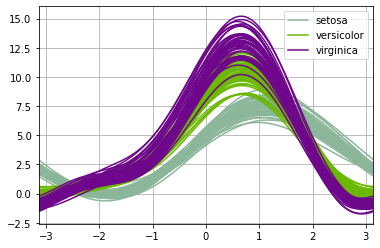
We can start, as most everyone does, with the iris dataset. The andrews_curves( ) method is defined within the pandas.plotting class, and its use is particularly easy. We wish to look at the numerical data columns grouped by the Species.pd.plotting.andrews_curves(dfIris, 'Species')
As mentioned, every curve represents a single datapoint from the original dataset. We see one of the three bundles of curves, setosa, is distinct from the other two; there is considerable overlap between the versicolot and virginica curves. This is consistent with many other vews of the iris data and suggests that the iris data will not break down nicely into three clusters based solely on its four columns of data.
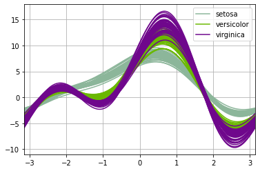
Running another plot on the same data but with different column orders we see that the plot looks different, but our conclusion does not change.test = pd.DataFrame({"Sepal.Width":dfIris["Sepal.Width"],"Petal.Width":dfIris["Petal.Width"],"Sepal.Length":dfIris["Sepal.Length"],"Petal.Length":dfIris["Petal.Length"],"Species": dfIris["Species"]})pd.plotting.andrews_curves(test, 'Species')
We see the shapes are different but setosa still appears distinct while there is substantial overlap between versicolor and virginica.
Since the whole point of Andrews curves is to help make sense of multidimensional data, let's look at a sample dataset with six dimensions rather than iris' four.
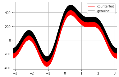
The Swiss Bank Note sample dataset contains 200 rows of data representing the physical dimensions of real and counterfeit banknotes. As before, we can plot the Andrews curves.pd.plotting.andrews_curves(dfBankNotes, "Type",color=["red", "black"])
We clearly see that the shapes of the curves are virtually identical, but the position of the "counterfeit" line is shifted, suggesting that the two groups have distinct characteristics.
The plot also illustrates a potential problem; one shared with the time-honored scatterplot. If there are too many datapoints, there may be so much overlap among points that individual datapoints are not discernible. We nay wish to plot a subset of the initial data.pd.plotting.andrews_curves(dfBankNotes.sample(n=20), "Type",color=["red", "black"])
By plotting fewer points, we accentuate the fact that each curve represents a datapoint.

Conclusion
Andrews curves, as implemented by Pandas, add another potentially useful tool for exploratory data analysis, particularly if we are curious about the similarity of groups within the data.
To determine if your data is "close enough" to a theoretical distribution to analize confidently, then check out the article, How to Interpret a Q-Q Plot (with Examples).