When I first evaluated Power BI a few years ago, what impressed me most was that, unlike Sharepoint Power View, a developer could create new visualizations and integrate them into PBI. Sometime later, Microsoft greatly expanded the ability of Power BI to include sophisticated graphs by adding to Power BI the ability to execute R scripts. Now, Microsoft is expanding PBI's graphic capabilities yet again, but this time in a somewhat different direction: the ability to integrate Visio diagrams into a Power BI report.
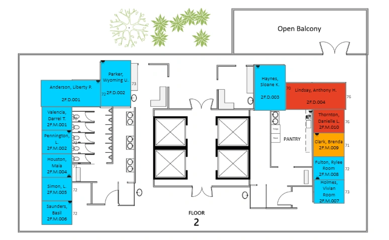
Any Visio diagram can be an integrated Power BI tool to drill down into the report. The trick is that the name of each object in the Visio diagram must correspond to a column value in the Power BI database. Since only the object name is necessary to establish the correspondence between the diagram and the data, the actual nature of the diagram is unrestricted: anything you can create in Visio is fair game. An office layout from one of the example PBI reports provided by Microsoft is shown here.
Other examples include organizational charts, administrative and industrial processes, and product quality root cause analysis (RCA). One application I found particularly interesting was the correlation of retail sales with the physical layout of a department store and the ability to click on specific display counters in the store. For example, do counters near potted plants sell more?

The first step in creating a Visio/Power BI report must be to create a Visio diagram. The completed diagram must then be saved to One Drive for Business or Sharepoint Online. Unfortunately, there seems to be no provision for creating a Visio/Power BI report using a local Visio file. At least as of June 2018, there is no indication that this capability is forthcoming.
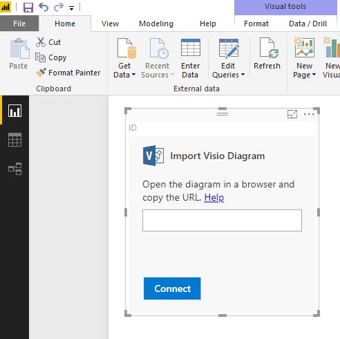
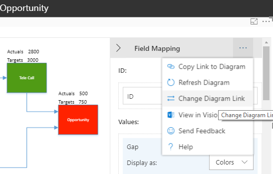
Download and install the Visio custom visualization as you would any other custom visualization. The Visio icon will appear in your Visualizations toolbox. First, create a blank visualization on your report canvas. Then, from the fields list, select the appropriate column (the one that provides the ID value matching the diagram) from the Power BI database. You will then be asked to provide a URL to the online Visio diagram file. When the Visualization successfully connects to your Visio diagram, a field mapping list will appear at the righthand edge of the Visualization.
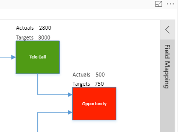
The dropdown menu within the Field Mapping list provides the means for refreshing the diagram or providing an entirely new diagram URL.
It was fascinating to see the variety of creative custom visualizations that Power BI developers developed when it first came out. Seeing the innovative applications that users will create with Power BI and Visio diagrams will be just as fascinating.
Use data like a pro and communicate information effectively with Business Intelligence Training
This piece was originally posted on August 8th, 2018, and has been refreshed with updated styling.